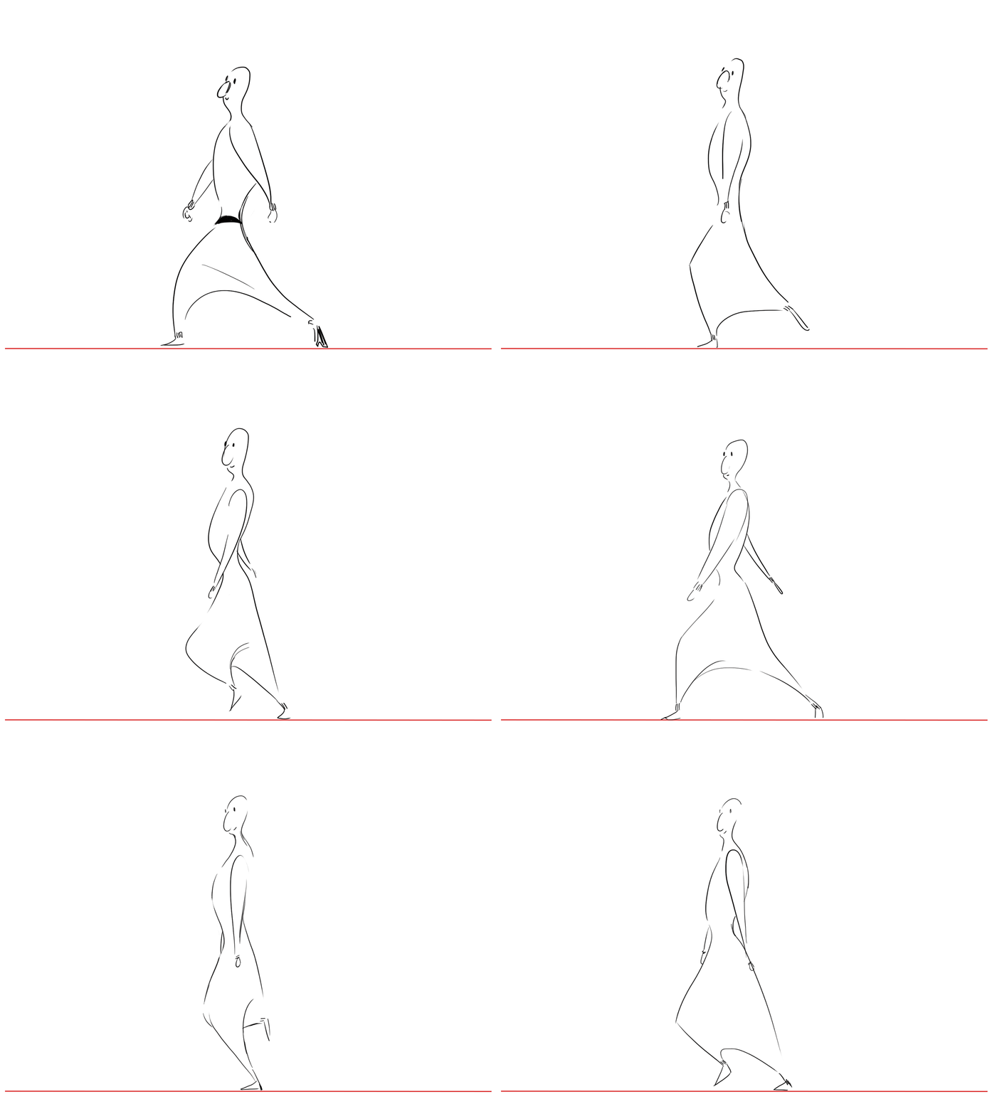
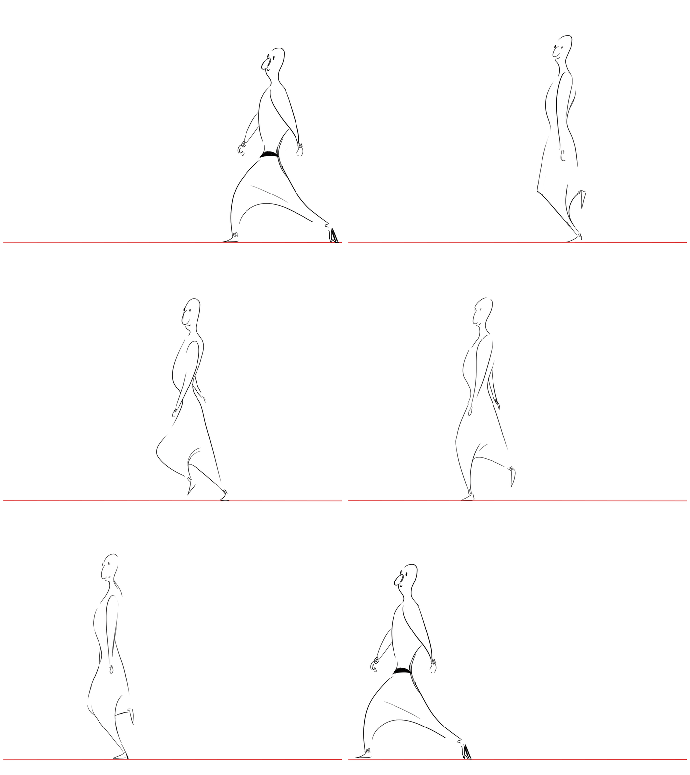
Walk Cycle 3
- Nov 7, 2018
- 1 min read
I used the frame from Walk Cycle 2 to animate this. I think that the MC Hammer style pants make the extra bendy legs look less weird, and the goofiness of the character design compliments the strange walk. I actually really like Walk Cycle 3, even though I think the individual frames are weak.


Comments